This document serves as a preliminary catalogue of requirements for the planned face-lift of the Orient-Institut Beirut’s website. To comment and annotate this document via hypothes.is click here
This document was last edited 4 June 2018.
The Orient-Institut Beirut plans a facelift of its website The main purposes for this facelift are:
There will be only minor changes to the general structure and content of the website. The main addition will be an alumni section, which, however, shall be modelled on the existing subpages of the people section.
Currently, search is implemented as a link to Google. For the redesign, we would like to see functional search of our website included in the website itself. This, however, is of the lowest priority of all changes.
We would like to retain the colour scheme of three main colours: green, yellow, red. But the current, muted colours should be replaced with brighter versions.
Regardless of whether responsive design will be implemented, the website should use the full width of modern computer screens (min 1200px)
Redundant menus and navigation options shall be removed and the header and horizontal navigation bar need to be redesigned.
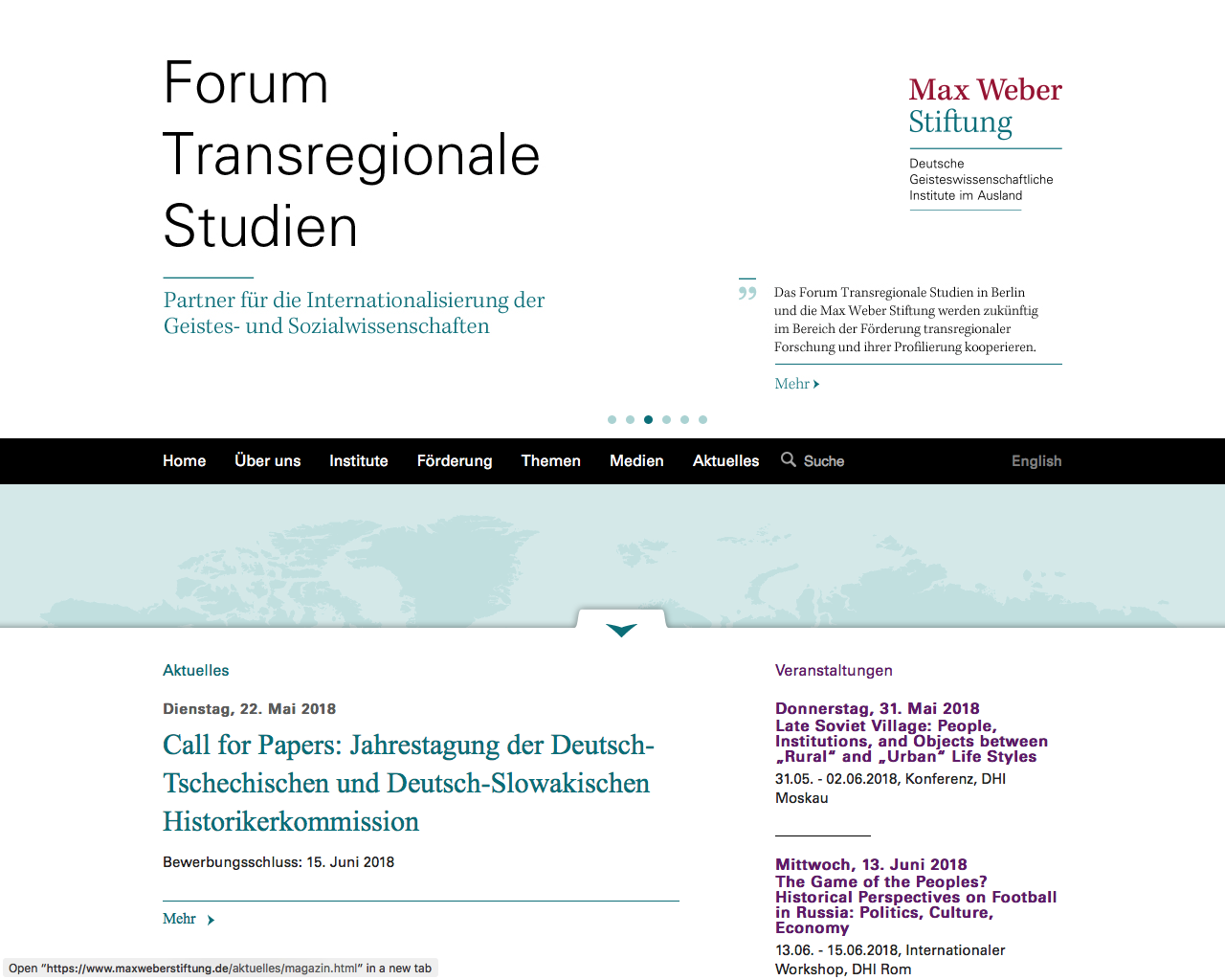
The website of the Max Weber Foundation can serve as an example for being well-organised. However, we prefer a brighter colour scheme.
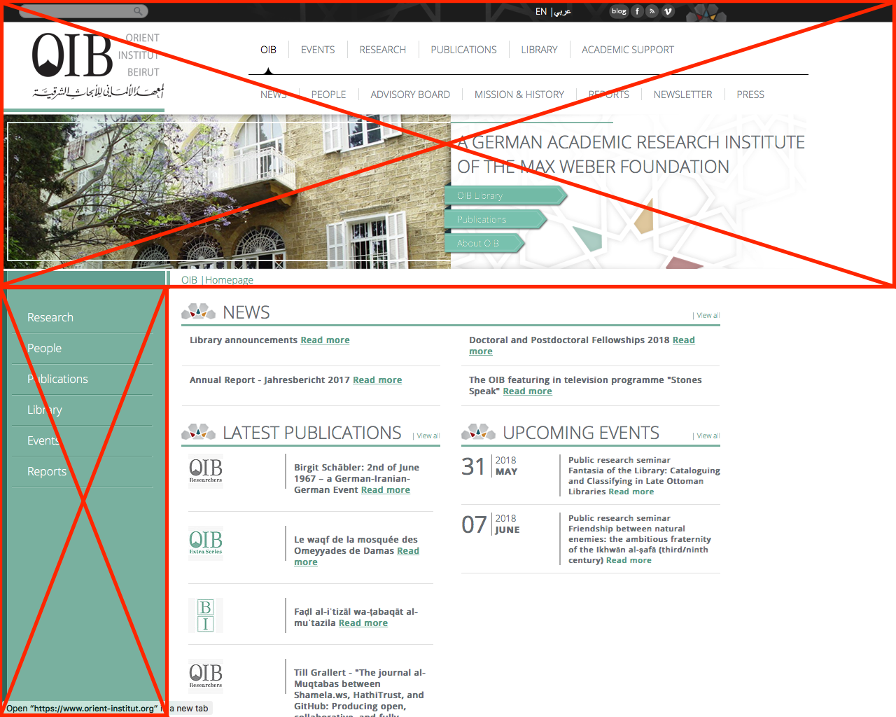
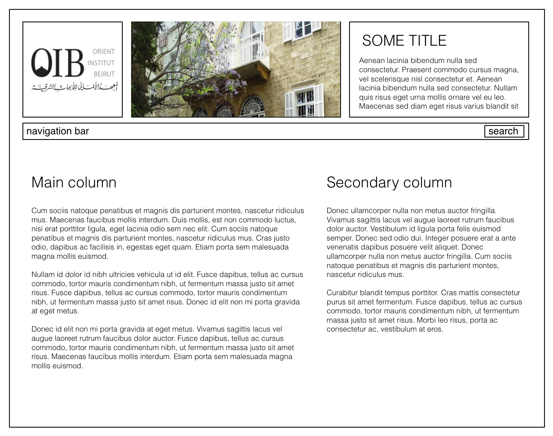
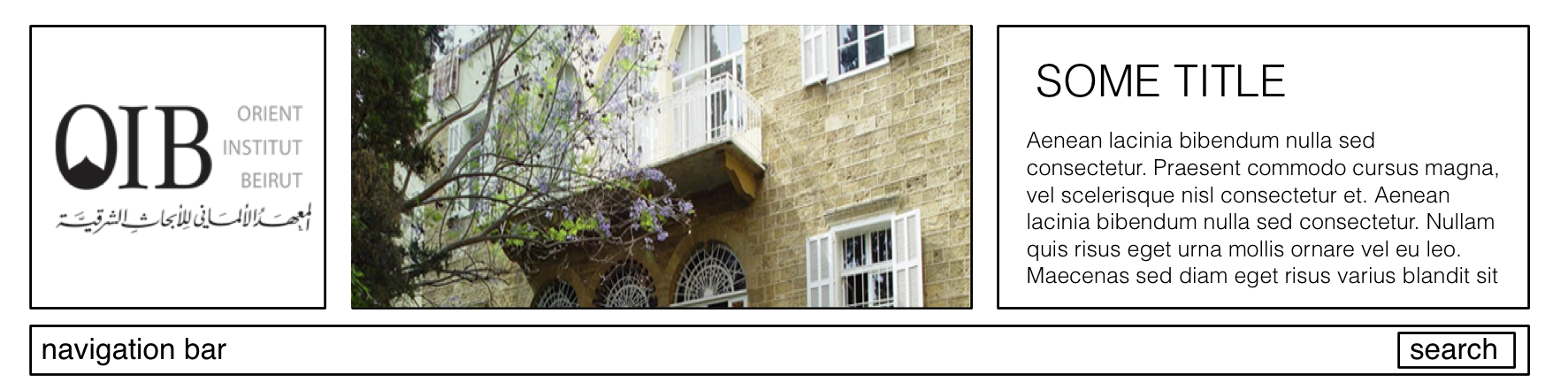
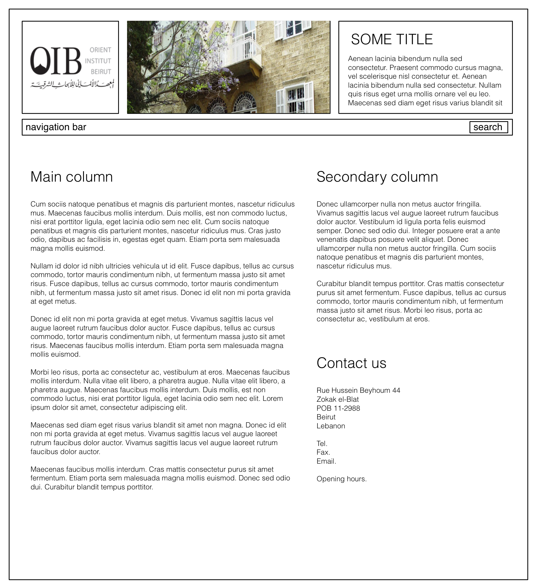
The header for all pages shall include a main bar with three sections (from left to right): OIB logo, image(s), some descriptive text for the current site.
The horizontal navigation bar shall be simplified and always highlight the current selection to provide the reader a clue as to where on the site they currently are. With these changes, the display of the current path can be removed.
index.html
The navigation bar on the left: shall be removed without replacement
The main content window should be organised into two unevenly sized columns: the main content column on the left and another column with additional information.
The column headers shall remain as they are and retain some sort of a logo:


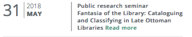
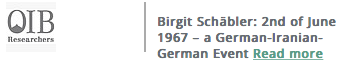
For entries in lists—such as events, news or publications—that point to sub-sites with more information, remove the trailing “Read more” and convert the entire item into a link. Also fonts and font-sizes should be unified.
The footer is in urgent need of a redesign. All redundant information needs to be removed; this includes the logo, “upcoming events”, “face me on facebook”, “RSS”, “vacancies”. The link to “Find us on the map” is dysfunctional and needs to be removed. This information can be found under “contact us”, which needs a new location
The footer currently links to a subsection of the main page, with a new secondary horizontal navigation bar not not otherwise accessible. This needs to be removed.

Most of the currently available information shall be removed from the footer, while social media buttons need to be moved here.
Each section should have its own main colour, similar to the current website but brighter.
index.html (link)Adopt the two-column layout. Get rid of the “News” section on the top. Integrate new publications and news into one column. To retain the style of the lists, one might have to design a generic “news” icon.
This main landing page also needs to integrate the relevant contact information without another click. We suggest the lower section of the left column.
Change the title to “Events” instead of “upcoming events”), add an integrated applet/box on the page (on the right side) containing years to archive past events (thus, the events page will have two columns).
The main column should contain a list of links to events sorted from the newest to the oldest:
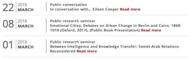
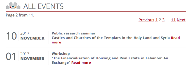
This site needs to provide some means of breaking lists of more than 10 entries into subpages. One could retain the currently available at the list of all events
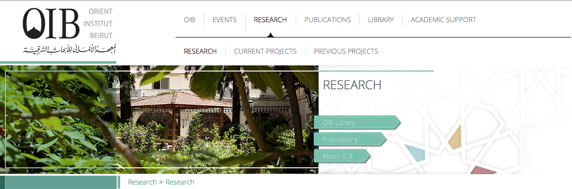
Similar to events, an integrated applet/ box on the right side should provide navigation to subpages. In addition, the graphic visualising the relations between various research projects should be made functional (i.e. clicking on project names should link to the description of the project) and moved to the top of the page
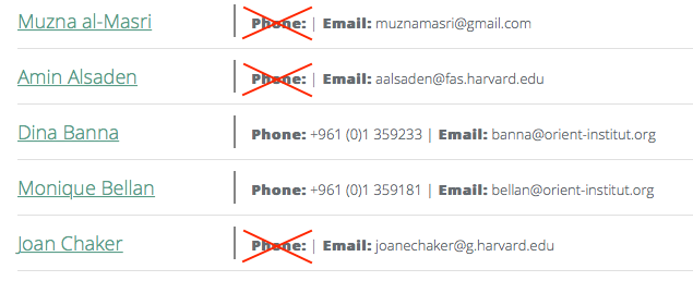
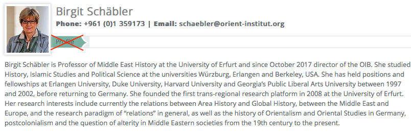
main page: retain lists of people sorted by surname. Add a photo to each entry (already available on the individual detail pages).
Remove labels for empty fields.
individual detail pages
Retain the current structure of some free text description and a structured list of publications. All fields should allow hyperlinks. Make sure to provide links to research projects.
Remove the “Profile” label.
Similar to events, an integrated applet/ box on the right side should provide navigation to subpages.
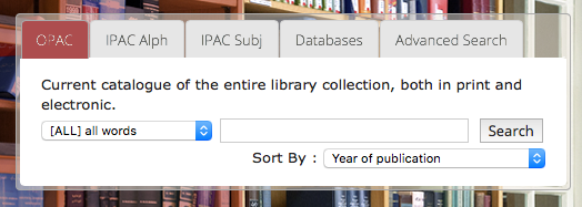
Adopt all changes to the main layout but retain the search field for the library catalogues in the header.
Remove the subsection Library/About/Library Team since this is part of People/.
https://www.orient-institut.org/events/event-details/https://www.orient-institut.org/events/all-events/dateFilter/2018/04/. This points to a list of all events that took place in April 2018. One would expect URLs for individual events to retain the date format, but they do not; e.g. https://www.orient-institut.org/events/event-details/migrant-labour-and-the-structure-of-the-labour-market-in-lebanon/